

From 2015, the usage of the mobile internet has been increased the usage of the computer. So from the rise of smartphones over the past decade, mobile devices have become an essential part of everyday life. Thus from making a purchase to finding a new restaurant or to making deposits to your bank, smartphones have revolutionized the way we do everything. So if you are a business owner with a website then making your website mobile friendly is essential to complete in the digital space and find new customers. It is necessary to make your website user-friendly for users.
As we all know that there are several elements that go into making your website mobile-friendly from a design, content, and the technical perspective. Nowadays users interact much more with the mobile sites and discovered a series of the different design principles on how to make your mobile website good, effective and reliable for the users. It helps to give an enjoyable experience for users.
To make a mobile-friendly website they are organized into the five key areas: easy navigation, easy conversions, easy forms, and easy on mobile. Have a look at each and every category.
Easy Navigation

So it is necessary that you will be able to easily navigate your website and find the information users want is essential to giving users a positive experience on your website. If the users did not find the information they are looking for then the users will likely bounce. Therefore the making of the best of the limited space on mobile devices to show users the most important information gives your website a mobile-friendly design. Below mention are some of the important principles of the mobile navigation are:
Keep calls to action front and center
It is very easy to miss the things on the small screens by having the most important CTAs displayed clearly and prominently should be at the forefront of your mobile website. It helps to optimize website on search engine easily.
Try to keep the menus short and sweet as well as distinct
While when you are on a desktop you may have a room for the lengthy menu, the mobile users have less patience to scroll so you should present as few menu items as possible and make their purpose obvious.
Make the easy thins that helps to get back to the homepage
As mobile users navigate through your website, then it should be clear and easy for them to return to the homepage. Therefore Google recommends using the logo at the top of the page as a button that the users can easily understand can be used to take them back.
Don’t let the promotions to steal the show
Thus the large banners, promotions, and ads can be distracting for the users. Especially on the limited space mobile devices provide. Thus be sure to use them sparingly and make sure they don’t distract from the main information that you want to provide to users is about their own business.
Easy Search

Therefore searching through this site is a vital function for the users to take the advantages of when they access your website on their mobile device. And they are looking for the information in a hurry. Focus on the design of your website with the help of these principles in mind to maximize the value of the site search on the mobile.
Put your search bar in the text box at the top
Therefore when some user is coming to the site for looking to a piece of specific information. They will be looking for the search bar as soon as they land on the site, so putting it in a spot where they can easily see it is best. Data from the study shows that users respond best to an easily visible, open text search box at the top of the page. As well as ensure that site search results are relevant.
Ensure search results are relevant
Thus of course, if the users are using the site search to find the certain information you want to make sure the right information is being presented to them. It is necessary to make sure that the first results are the strongest because users are not even likely to swipe through multiple pages of search results.
Offer the search filters
Therefore it is depending on how big your website is. Thus it might be worth to include the search filters to help users to find the right and relevant information faster. Google recommends offering a filter to help the narrow down results but ensure that the users won’t get the zero results on their searches.
Guided the users to better site search results
If it is applicable then users will provide you more information about themselves to provide you effective and better results. It helps to make your website user-friendly.
Easy Conversions

This is the goal of each and every website that it gets more and more sales, web leads or the conversions. So whether it is the phone calls or getting them to sign up for an account, making a purchase or it fills out a contact form. So when you are designing a website you should keep your mind in how easy the process of converting is for the user with the help of these principles.
Do not ask users to commit first let them explore
It was recorded by a study that users became frustrated when the owner asked them to commit too early. You should make sure that users browse the content before creating any barrier for them to continue.
Let users purchase as a guest
To make users feel flexible is that let the purchase of the use as a guest first. If you are one of them who are running an e-commerce site, it includes the option for the guest checkout. Thus the customers often become frustrated when they are forced to register and like the ease and the convenience of being able to check out as a guest.
As well as prefilled with the existing information
Thus the users don’t like having to repeatedly enter the information they have already inputted. So try to make any form filled with the pre-filled information will save the users time and make them more likely to complete a conversion. Many people take help of website designing company to make their website user-friendly.
Consequently, provide click to call buttons
Thus the forms will be more convenient for some of the users and on the other hand, many prefer to call to complete actions over the phone or get more information. When you include prominent click to call buttons at key places you will be able to capture more leads.
Make it easier to finish converting on another device
A user may come across your website on a mobile device but wait to convert later from their desktop or another device. By offering things just like the social share buttons, email or a save to cart option it helps the user return to the site to convert at a later time.
Easy Forms
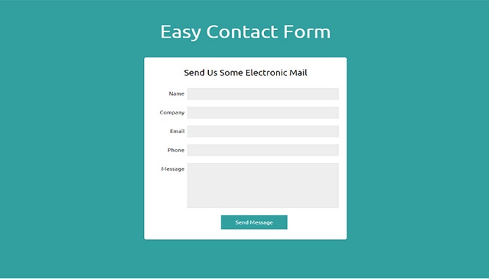
In the previous topic, we mentioned that the conversions are important and forms are an essential part of the conversions. So when completing the forms on the mobile devices can often be a frustrating process for the mobile device users. Then with the help of the streamlining your forms you will make it an easier experience for the users on the mobile devices.
Try to add the features that make the entry of the form easier
These things will help to make the experience of the user easier when filling out the forms. Thus when prompted to input a zip code and a site can automatically present a number pad. Then you have to consider the different ways that make completing the form easier from a user perspective and implement them.
The simplest method of the input
Each and every individual look for getting the simplest method of getting the information. For instance, it includes a drop-down menu of the options rather than a text input if you can.
Offering a visual calendar for selecting dates
If the users book the things on a certain date through your website like the restaurant reservations, you should be sure for presenting visually and a calendar to make it easier for selecting the right date.
Thus the label forms it clearly and error checks the entries
So make sure that there is no confusion to the user on what they are inputting. Therefore a common error was when websites asked for an address but did not differentiate between the street address and email address.
Make the forms easy and efficient
Thus the simpler forms broken into the clearly labeled parts are easier for the user to navigate than complex, multi-platform.
Easy on Mobile

Thus there are few more things that you can do to simply make the site easier for the user on a mobile device that will enhance their overall experience.
Optimize your entire website for mobile
Therefore if your pages are designed specifically for the mobile, users will have an easier time navigating it then trying to navigate a desktop site on the mobile devices.
Do not make the users pinch and zoom
Thus when the users have to pinch and zoom to access certain information, they are often frustrated and may exit the site. It designs the mobile site so users won’t have to change the size.
Make the product images more expandable
Specifically, on retail sites, make any images of a product as easy to see as possible for the user. Any important images to your business’s offerings should be high-quality and close up.
Discuss to users that which screen work is best
Make sure that your website is designed for the landscape or portrait and tell the users that when they need to switch a different orientation. Thus however be sure your users can complete the important calls to action from either orientation.
Keep users in the same browsing window
Switching browsing windows is much more difficult for users on a mobile device than on a desktop. Try to avoid calls-to-action that take them to a new window for an easier user experience.
Like & Share: @novelwebcreation

